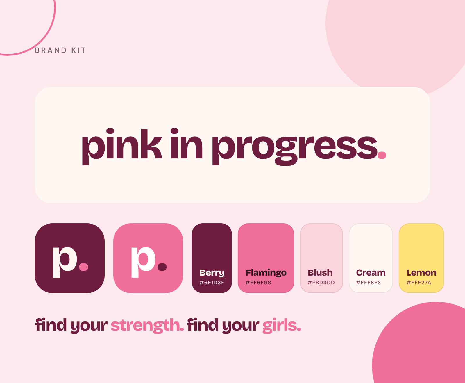
This is the Pink in Progress brand kit: our logo, colors, fonts, voice and the files you need to use them. It’s here for our team, our coaches and circle hosts, partners, press and anyone making something with us. If you’re creating a flyer for a walk club, a post for your circle or a slide for an event, start here.
Everything on this page is designed to make Pink in Progress feel the same everywhere: warm, encouraging, a little playful and never preachy. When in doubt, ask yourself: does this feel like a friend cheering you on? If yes, you’re on brand.
Just need the files? Jump to downloads for every logo, icon and social cover, in one place.
About the brand
Pink in Progress is a coaching and community brand for women. We bring women together through small circles, stroller walk clubs and one-on-one coaching, so they can feel stronger, find their people and keep making progress, especially in big seasons of life like new motherhood.
- 🌟TaglineFind your strength. Find your girls.
Our tagline says it all: we’re about feeling strong and feeling supported. Write it lowercase with periods: find your strength. find your girls.
- 🌱BeliefProgress over perfection
Our name is a promise that everyone is a work in progress, and that’s a good thing.
- 🤝BeliefTogether is easier
Habits stick better with people in your corner. Community is at the heart of everything we do.
- 💬BeliefHonest and kind
We tell the truth, cite our sources, stay in our lane as coaches and never shame anyone.
Our personality in four words: warm, honest, encouraging and real. We sound like the friend who texts you to go for a walk, not the trainer who yells at you to do one more rep.
Our logo
Our logo is a simple lowercase wordmark: pink in progress. The pink period at the end is the most important part. It’s a little exclamation of confidence, as in “we’re in progress, period.” We have four versions.
- pink in progress.
Primary logo. Berry with a Flamingo dot, on Cream or white.
- pink in progress.
White logo. White with a Flamingo dot, on Berry or dark photos.
- pink in
progress.Stacked logo. For square or narrow spaces.
- p.p.
Icons. For profile photos, favicons and anywhere the full name won’t fit.
Clear space and minimum size
Give the logo room to breathe. Leave clear space on every side equal to at least the height of the letter “p” in the logo. Don’t let text, photos or edges creep into that space.
Keep the horizontal logo at least 120px wide on screens and 1.25 inches wide in print. Smaller than that, use the icon instead.
Writing our name
- In the logo: always lowercase with the pink dot: pink in progress.
- In sentences: Pink in Progress, with a capital P and P and a lowercase “in.”
- Never: PIP, Pink-in-Progress, PinkInProgress or Pink In Progress. (In hashtags and handles, #pinkinprogress is fine.)
Logo do’s and don’ts
Do use the files from this page, keep the colors as designed and give the logo plenty of space. And please don’t do any of these:
- ❌ColorsDon’t change the colors
The wordmark is Berry with a Flamingo dot, or white with a Flamingo dot on dark backgrounds. No other combinations.
- ❌ProportionsDon’t stretch or squish it
Always scale the logo evenly. Hold Shift when resizing in most design tools.
- ❌LowercaseDon’t capitalize the logo
The wordmark is always lowercase: pink in progress. In sentences, we write Pink in Progress.
- ❌The dotDon’t drop the dot
The pink period is part of the logo. It’s our little “and we mean it.”
- ❌Keep it cleanDon’t add effects
No drop shadows, outlines, glows, gradients, bevels or rotation.
- ❌LegibilityDon’t place it on busy photos
If the background is busy, put the logo on a solid Cream or Berry block, or use a quieter part of the image.
- ❌FontDon’t retype it in another font
Use the logo files. If you must type it, it’s Bricolage Grotesque ExtraBold (800) with tight letter spacing.
- ❌Clear spaceDon’t crowd it
Leave clear space around the logo at least the height of the letter “p” on every side.
Colors
Our palette is built around two hero colors: Berry, a deep, grounded pink-purple, and Flamingo, a bright, happy pink. Everything else supports them. A good rule of thumb: mostly Cream, lots of Berry, a little Flamingo and a tiny bit of Lemon.
- Berry#6e1d3f
- Flamingo#ef6f98
- Flamingo Deep#d9517e
- Blush#fbd3dd
- Petal#fdeaef
- Cream#fff8f3
- Ink#2d1622
- Cocoa#4a3540
- Mauve#7d6670
- Lemon#ffe27a
- Lemonade#fff4c4
The 60-30-10 rule
- Cream and light pinksBackgrounds and spaceCalm base
- BerryHeadlines, text and dark sectionsStructure
- FlamingoButtons, the dot, highlight wordsThe pop
- LemonIcons and the occasional badgeSunshine
Color pairings
Pretty isn’t enough; people need to be able to read it. These pairings show how our colors work together, with their contrast ratio. For accessibility, normal text needs at least 4.5:1, and large or bold text needs at least 3:1, under the Web Content Accessibility Guidelines (WCAG).
- Aa find your girls.
- Aa find your girls.
- Aa find your girls.
- Aa find your girls.
- Aa find your girls.
- Aa find your girls.
- Aa find your girls.
- Aa find your girls.
- Aa find your girls.
- Aa find your girls.
- Aa find your girls.
- Aa find your girls.
The big takeaway: Flamingo is for accents, not reading. Use it for the logo dot, big highlight words and shapes. For text, Berry, Cocoa and Ink are your best friends. For buttons, Flamingo Deep with cream text or a Berry button reads more easily than white text on Flamingo.
Typography
We use two free Google Fonts. One is big, bold and full of personality; the other is clean and easy to read.
abcdefghijklmnopqrstuvwxyz 0123456789
Small circles, stroller walk clubs and one-on-one coaching for women who want to feel stronger and find their people.
ABCDEFGHIJKLMNOPQRSTUVWXYZ abcdefghijklmnopqrstuvwxyz 0123456789
- Headlines are Bricolage Grotesque 800, lowercase, with tight letter spacing (about −3% to −4.5%). Highlight one or two words in Flamingo.
- Body text is DM Sans at a comfortable size (16 to 19px on screens), with generous line spacing (about 1.6 to 1.75).
- Labels are DM Sans SemiBold, uppercase, small (11 to 13px) with wide letter spacing (about 12% to 16%).
- Fallbacks: if Bricolage Grotesque isn’t available, use Arial Rounded MT Bold. For DM Sans, use Helvetica Neue or Arial.
- Where to get them: both are free on Google Fonts (Bricolage Grotesque) and Google Fonts (DM Sans). In Canva, search for each font by name.
Voice and tone
How we sound matters as much as how we look. We write the way a supportive friend talks: warm, direct, a little funny and always honest.
- 👋WarmWarm, not gushy
Friendly and encouraging, without over-the-top hype or too many exclamation points.
- ✅HonestHonest, not preachy
We share real stories and real research, and we’re clear about what we don’t know. We cite sources.
- 💪EncouragingEncouraging, not pushy
We invite women in. We don’t guilt, shame or pressure anyone.
- 😁RealReal, not polished
Short sentences, everyday words, a little humor. We talk about the messy parts too.
- 🩺ResponsibleIn our lane
We’re coaches and a community. For medical, mental health or nutrition therapy questions, we point women to the right professional.
- 📋ClearClear and simple
Plain words over jargon. Short paragraphs. One idea at a time.
Quick writing style
- Write headlines in lowercase or sentence case. Never all caps, except for tiny labels.
- Use “you” and “we.” Talk to one woman, not a crowd.
- Keep paragraphs short, especially on social media and email.
- Use emoji as friendly signposts, not decoration. One or two per post is plenty.
- Every testimonial or member story must be real and shared with permission. When we use a made-up example, we say so.
Words we use (and avoid)
- 💖We sayWomen, moms, friends
We talk to women like friends. “Girls” in our tagline is about friendship, the way women say it to each other.
- 🌱We sayProgress, not perfection
Small wins, consistency, showing up. Our name is literally about being in progress.
- 🤝We sayCircles, community, your people
Our groups are circles, and the goal is belonging.
- 🏃♀️We sayStrength, energy, feeling good
We focus on how women feel and what their bodies can do.
- 🚫We avoid“Bikini body,” “bounce back,” “snap back”
Bodies don’t need to go back to anything. We don’t put timelines on women’s bodies.
- 🚫We avoid“Guilt-free,” “cheat meal,” “clean eating”
Food isn’t a moral choice. We don’t use language that attaches guilt or shame to eating.
- 🚫We avoid“No excuses,” “crush it,” “beast mode”
Real life gets in the way sometimes. We meet women where they are.
- 🚫We avoidMedical promises
We’re coaches and a community, not doctors. We never promise to treat, cure or diagnose anything, and we cite our sources.
Photography
Our photos should feel like a sunny morning with your best friend. Here’s what we look for.
- ☀️LightWarm, natural light
Morning light, golden hour and sunny windows. Bright and airy, never dark or moody.
- 🌸ColorSoft pink accents
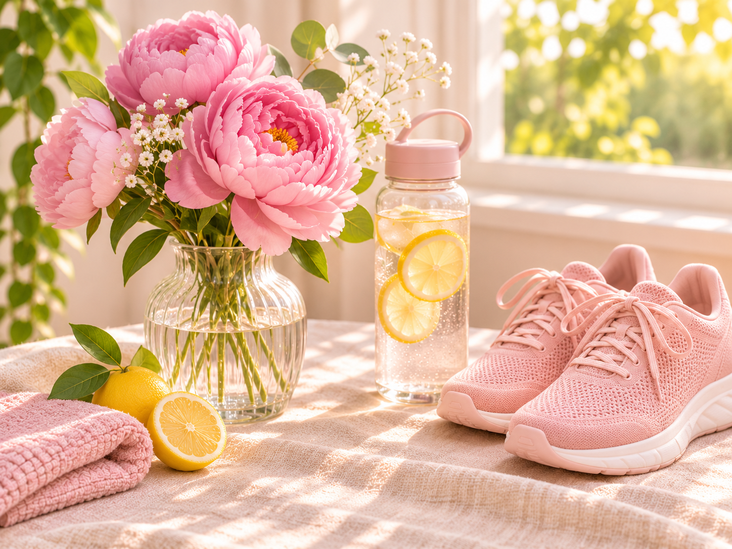
A pink towel, peonies, sneakers or a water bottle. A touch of brand pink in each image ties everything together.
- 👩👩👧PeopleReal women, real life
Women of different ages, sizes, backgrounds and stages of life, doing real things: walking, laughing, feeding a baby, stretching on a living room floor.
- 🏠SettingsEveryday places
Kitchens, parks, sidewalks, living rooms and coffee shops. Places our members actually are.
- 🚫NeverNo before-and-after photos
We celebrate progress, not bodies as projects. No weight-loss comparisons.
- 🚫NeverNo fake testimonials or logos
Photos never imply someone is a member or endorses us unless they are and they’ve said yes. No text or brand logos in images.
Image prompt formula: when we create images for the blog, we use a simple recipe: bright, airy lifestyle photo of [subject] in [everyday setting], soft morning window light, a touch of blush pink, warm cream tones, shallow depth of field, no text, no logos.
Design elements
These small details make something feel like Pink in Progress at a glance.
- ⭕ShapesCircles
Soft circles and rings in Blush and Flamingo, often bleeding off the edge of the frame.
- 💊ButtonsPill buttons
Fully rounded buttons with an arrow. Flamingo for the main action, outlined Berry for secondary.
- 🌁ImagesArched images
Hero images use an arch shape: rounded on top, softly squared at the bottom.
- 📄CardsRounded cards
Cards have generous rounding (about 16 to 26px), soft borders and an emoji in a Lemonade circle.
- 💬HeadlinesLowercase headlines
Big, bold, lowercase headlines with one or two words highlighted in Flamingo.
- 🏷️LabelsSmall uppercase labels
Tiny DM Sans labels in uppercase with wide letter spacing for categories, dates and tags.
Putting it into practice
Here’s how the brand comes together in the things we make most often. Use these as starting points, not strict templates.
- 📰PrintWalk club or circle flyer
Cream background, a big lowercase headline in Berry with one word in Flamingo (“come walk with us.”), the date, time and meeting spot in DM Sans, and the logo at the bottom. One bright photo, if you have one.
- 📷SocialInstagram or Facebook post
One idea per post. Use a warm photo or a solid Cream or Berry background with a short headline. Keep text on the image under about ten words and put the details in the caption.
- 📧EmailEmail newsletter
Logo at the top, a friendly lowercase headline, short paragraphs, one Flamingo or Berry button and a warm sign-off. Plain and personal beats busy and salesy.
- ✉️EverydayEmail signature
Your name and role in DM Sans, a link to pinkinprogress.com and the small logo on cream. Skip quotes, extra images and multiple colors.
- 💻PresentingEvent or workshop slides
Cream slides with Berry headlines, one idea per slide and big type. Use Berry slides with white text for section breaks.
- 👕ProductsMerch and swag
The stacked logo or the icon on Cream, Blush, Berry or white. Keep it simple: one logo, one or two colors, plenty of space.
Before anything goes out, give it a quick gut check. Does it feel warm and encouraging? Is it easy to read? Could someone tell it’s Pink in Progress even without the logo? If you can answer yes to all three, it’s ready.
Accessibility checklist
We want every woman to be able to read, use and enjoy what we make, including women with low vision, color blindness or who use screen readers. A few simple habits go a long way.
- Check your contrast. Use the pairings above. Body text should be Berry, Cocoa or Ink on a light background, or Cream on Berry.
- Don’t rely on color alone. If something matters, say it in words or with an icon too, not just by making it pink.
- Keep text big enough. On screens, body text should be at least 16px. On flyers, make the date, time and place easy to read from a few feet away.
- Add alt text. Describe every meaningful image in a sentence, like “Three moms pushing strollers along a sunny park path.”
- Write clear links and buttons. “Find my circle” beats “Click here.”
- Caption your videos. Many people watch with the sound off, and captions help people who are deaf or hard of hearing.
- Go easy on emoji and all caps. Screen readers read every emoji out loud, and all caps is harder to read.
Social media sizes
Each platform crops images a little differently, so we design each cover for its spot. Here’s a quick reference for the files we have.
| Where | Upload size | Notes |
|---|---|---|
| Facebook cover | 1640 × 624 | Shows at 820 × 312 on desktop and is cropped to the center on mobile. Keep text centered and away from the bottom left. |
| LinkedIn personal banner | 3168 × 792 | 2× the standard 1584 × 396 (4:1). Your profile photo covers the left side. |
| LinkedIn company cover | 2256 × 382 | 2× the standard 1128 × 191. The page logo covers the bottom left. |
| Profile photos | 1000 × 1000 | Use an icon. It works for Facebook, Instagram, LinkedIn and more, and crops nicely to a circle. |
| Website favicon | 1000 × 1000 | Use the berry icon. Squarespace resizes it automatically. |
We’ll add more sizes, like Instagram posts, stories and email headers, as we create them. Platforms change their sizes from time to time, so after you upload a new cover, always check it on both a computer and a phone before calling it done. If something important gets cut off, nudge it toward the center and try again.
Downloads
Pick the files you need. Each button opens the full-size PNG: right-click and choose “Save image as” on a computer, or press and hold on a phone. Files with a transparent background are marked “transparent.”
Logos and icons
| File | Size | Best for | |
|---|---|---|---|
| Primary logopink-in-progress-logo.png | 1813 × 340 · transparent | Light backgrounds, website, documents | Download ↓ |
| White logopink-in-progress-logo-white.png | 1813 × 340 · transparent | Berry or dark backgrounds, photos | Download ↓ |
| Logo on creampink-in-progress-logo-on-cream.png | 1813 × 340 | Email signatures and tools that don’t support transparency | Download ↓ |
| Stacked logopink-in-progress-logo-stacked.png | 1042 × 500 · transparent | Square spaces, merch, social | Download ↓ |
| Icon, berrypink-in-progress-icon.png | 1000 × 1000 | Profile photos, favicon, app icon | Download ↓ |
| Icon, flamingopink-in-progress-icon-pink.png | 1000 × 1000 | Alternate profile photo | Download ↓ |
Social covers
| File | Size | Notes | |
|---|---|---|---|
| Facebook coverCream · Berry | 1640 × 624 | Displays at 820 × 312 desktop, cropped to the center on mobile. Profile photo covers the bottom left. | Cream ↓ Berry ↓ |
| LinkedIn personal bannerCream · Berry | 3168 × 792 | 2× the 1584 × 396 (4:1) size. Profile photo covers the left side. | Cream ↓ Berry ↓ |
| LinkedIn company coverCream · Berry | 2256 × 382 | 2× the 1128 × 191 size. Logo covers the bottom left. | Cream ↓ Berry ↓ |
Partners, press and circle hosts are welcome to use these files to talk about Pink in Progress. Please don’t use our logo in a way that suggests we endorse a product or event unless we’ve agreed to it. Need something you don’t see here? Get in touch.
Sources
- Brand
- Brand guidelines
- Logo
- Colors
- Downloads
Find your strength. Find your girls.
Want to host a circle, partner with us or join? Tell us where you are and we’ll reply within two business days.
Questions
Good questions.
What colors does Pink in Progress use?
Our two main colors are Berry (#6E1D3F) and Flamingo (#EF6F98), on a Cream (#FFF8F3) background. Supporting colors include Blush (#FBD3DD), Petal (#FDEAEF), Ink (#2D1622), Cocoa (#4A3540), Mauve (#7D6670), Lemon (#FFE27A) and Lemonade (#FFF4C4).
What fonts does Pink in Progress use?
Headlines use Bricolage Grotesque ExtraBold (800), lowercase with tight letter spacing. Body text uses DM Sans. Both are free on Google Fonts.
Can I use the Pink in Progress logo?
Circle hosts, partners and press can use our logo files to talk about Pink in Progress. Please use the files as provided, follow the logo guidelines and don’t imply an endorsement we haven’t agreed to.
How do I write the Pink in Progress name?
In the logo it’s always lowercase with a pink period: pink in progress. In sentences, write Pink in Progress.
What size should the Facebook and LinkedIn covers be?
Our Facebook cover is 1640 by 624 pixels. Our LinkedIn personal banner is 3168 by 792 (twice the 1584 by 396 standard), and our LinkedIn company cover is 2256 by 382 (twice the 1128 by 191 standard).
Keep reading
 Our story
 Community